If you’re a physician in Alberta, you know that billing and income management are essential to keeping your practice running smoothly. Understanding how to analyze your billing data can help you gain insights into your practice’s financial health, identify areas where you can improve your billings, and ultimately, maximize your income.
That’s where Statgo comes in. Statgo is a powerful platform that offers physicians reporting tools to help them analyze and understand their billings and income. In this blog post, we’re going to review Statgo’s reports, how to use them, and how to download your billing data.
Note: The sample images included below do not represent any real patient data.
Where do I find the Statgo reports?
To open Statgo’s reporting tool, use the following steps:
Login to your statgo account https://billing.statgo.ca/#!/login
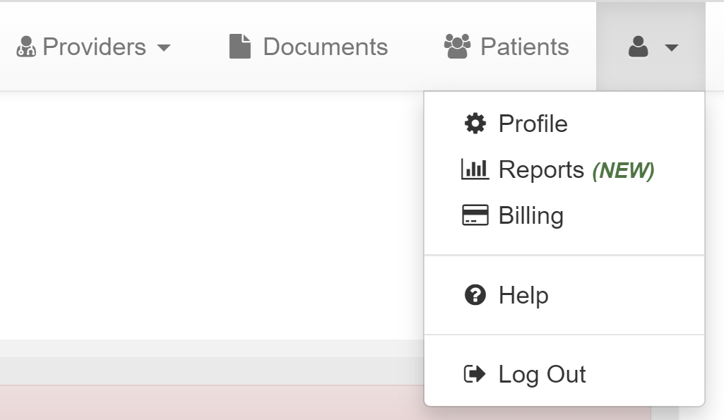
Click on the Profile Icon > Reports (NEW)
What reports are available?
Statgo offers three key reporting views:
1. Date of Service
2. Date of Assessment
3. Comparison
Income Report by Date of Service
The Date of Service report view allows you to view your billings and income for a given period of time. For example, if you worked 10 shifts in the previous month and you want to know how much you billed and should expect to be paid, this report will provide these details.
At the top of the report, there are filters that allow you to select a subset of all your billings in Statgo. In these filters you can select:
Provider: This filter allows you to select claims from 1 or more providers under your account. For example, if you have 4 providers created in Statgo for 4 different hospitals you work at, this filter will allow you to select a view with only the billings from 1 or more facilities.
Date of Service. This filter allows you to select claims for a date of service period. For example, this could be the previous month or all the billings for the last calendar year. You can also select a period type for how to breakdown the data in the charts below (daily, weekly, monthly).
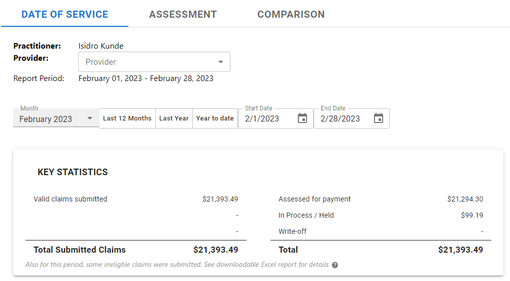
What the report shows:
Key Statistics: This table shows your income for the period and filters selected. On the left-hand side, you can see the total value of submitted claims. On the right-hand side, you can see the current status of those claims. These statuses are assessed for payment, in process/ held, write-off, and invalid claims.
Top Codes Billed: This chart shows the top 10 codes for the period/filters selected by monetary value.
Per Day Statistics: These show key metrics by calendar day for the period/filters selected. This includes the number of calendar days with claims, the average billings per day, the highest income day, and the lowest income day.
Breakdown Analysis: This pie chart shows your billings for the period/filters selected by work type, facility, skill, and payer type. To change what the chart shows, select the view type from the drop-down.
Exporting your claims: To export the claims for the period/filters selected, click the “Export to XLSX” button on the right-hand side above the charts and metrics. This will allow you to download the details for all the claims included in the report.
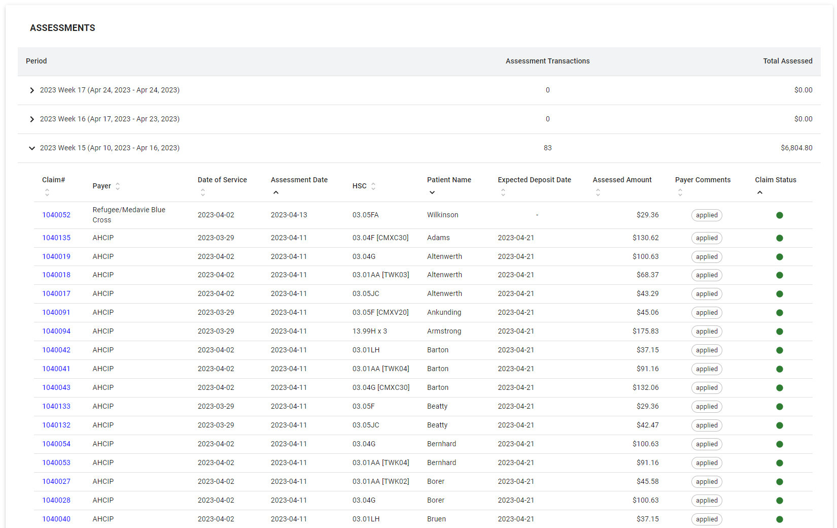
Assessment Report
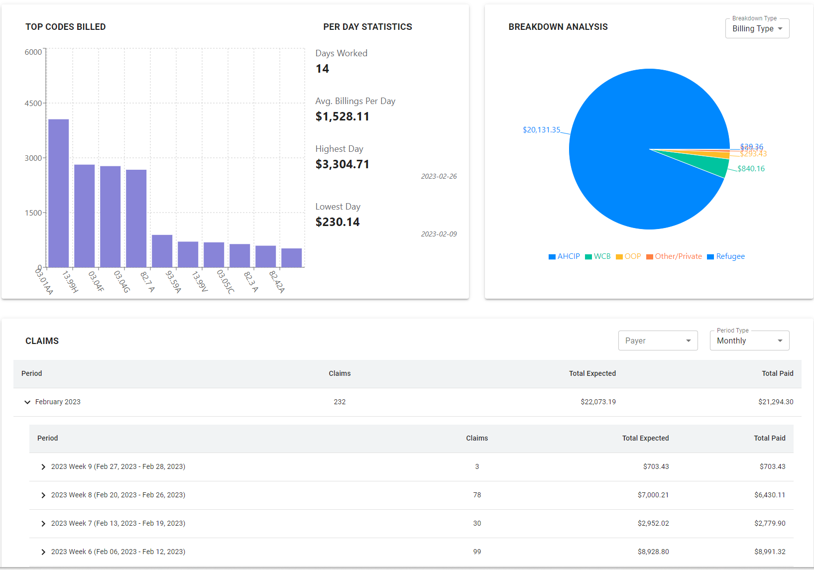
The Assessment Report allows you to view your claims by the assessment date, which is related to the payouts you receive in your bank account. For example, if you wish to know which claims make up a payment from AHCIP for a particular Friday, this report can provide those details.
At the top of the report, there are filters that allow you to select a subset of all your assessed claims in Statgo. In these filters you can select:
Provider: This filter allows you to select claims from 1 or more providers under your account. For example, if you have 4 providers created in Statgo for 4 different hospitals you work at, this filter will allow you to select a view with only the billings from 1 or more facilities.
Date of Service: This filter allows you to select claims for an assessment date range. For example, this could be all assessed claims for the past week. You can also select a period type for how to breakdown the data in the charts below (daily, weekly, monthly).
Payer: This filter allows you to filter for billing claims by insurance payer (e.g., AHCIP, WCB, MBC, etc.).
The report includes the following sections:
Assessment Chart: This shows the assessment totals by period breakdown type for the date range/filters selected. Hovering over any bar in the chart will provide details for the selected period.
Assessment Table: This provides details on each claim assessed in a given period, including the payer, date of service, assessment date, billing code, amount, and expected deposit date. There is also a link that will open up the claim in the Statgo software.
Exporting your claims: To export the claims for the date range/filters selected, click the “Export to XLSX” button on the right-hand side above the charts and metrics. This will allow you to download the details for all the assessed claims included in the report.
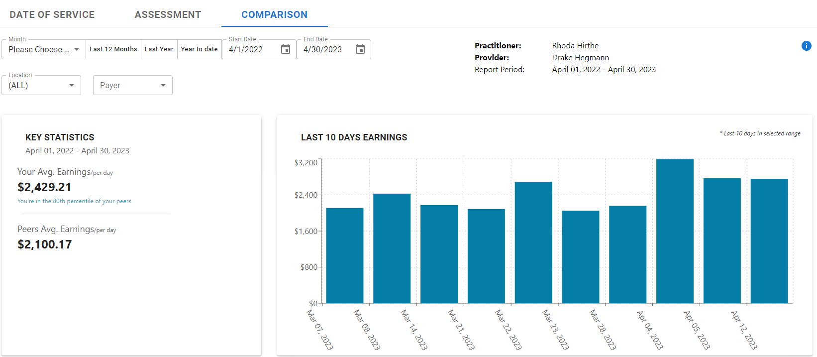
Comparison Report
Statgo’s Comparison Reports allow you to compare the types of codes you bill and your overall earnings vs. your peers in your specialty or billing group. The reports use anonymized billing data from your peers who have agreed to share their data to show you how you bill compared to the average. To see the comparison report, you need to opt-in and agree to share your anonymized data with everyone else in the comparison group. Comparison reports may not be available for your specialty or billing group.
At the top of the report, there are filters that allow you to select a subset of all your assessed claims in Statgo. In these filters you can select:
Provider: This filter allows you to select claims from 1 or more providers under your account. For example, if you have 4 providers created in Statgo for 4 different hospitals you work at, this filter will allow you to select a view with only the billings from 1 or more facilities.
Date of Service: This filter allows you to select claims for an assessment date range. For example, this could be all assessed claims for the past week. You can also select a period type for how to breakdown the data in the charts below (daily, weekly, monthly).
Location: This filter allows you to select a sub-group of billing claims related to facilities you work at.
Payer: This filter allows you to filter for billing claims by insurance payer (e.g., AHCIP, WCB, MBC)
The report includes the following sections:
Key Statistics. This metrics shows you average earnings per day for the date range/filters selected vs. your comparison group. The metrics will also show you what percentile your daily earnings fall in.
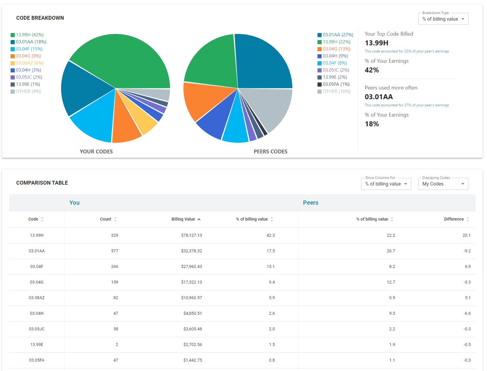
Code Breakdown. These charts compare your top 9 billings codes by earnings total vs. your comparison group. This breakdown can give you insight into how the types of billing codes you bill most often compares to the billing pattern for your peers. The section also highlights your top code billed vs. your peers and the code billed more often by your peers that you use less as a percentage of your earnings.
Comparison Table. This table gives you a detailed, code by code breakdown of what you bill and how that compares to your comparison group. You can filter and sort this table further to provide a more specific view of the codes.
How do I opt-in to the Comparison Reports?
To opt-in for comparison reports, please contact your Statgo agent. Your agent will advise if this feature is available for your specialty or group.
I want to use Statgo’s Billing Reports for accounting and taxes. Can I do this?
Some Statgo clients provide their accountants with billing reports from Statgo to help with year-end taxes. To export your claims, use the “Export to XLSX” button on the “Date of Service” or “Assessment” tabs.
I want my reports to reflect 100% of my billings. What if some of my billings are not processed by Statgo?
Some physician collect funds at bedside without submitting any claim for processing. You can add these claims to your Statgo account to ensure your Statgo reports fully reflect your income. To do this, login to your statgo account, create a new claim and select billing type “Private – Physician Collected.” This will store a record of the claim in your reports. There is no charge for these claim types in the Statgo system.
My Statgo invoice shows paid claims for the month. How do I pull a report to verify which claims are included?
To confirm your paid claims for each month, go to your Statgo Reports > Assessment Tab. Select the month you wish to view. Ensure you do not have any filters for Provider or Payer selected. In the Assessment table below, you will be able to verify the claims assessed as paid during the month.
Using Statgo’s Reports
Statgo’s reporting tool provides physicians with insight and control over their billings. We recommend clients regularly check their reports to help learn more about their billings and income. If you have questions about the reports, please let us know. We’re always happy to chat!
Other interesting articles
5 Tips to improve your AHCIP medical billing
Tips for billing COVID-19 and AHCIP Virtual Codes
Virtual medical billing codes and COVID-19
Alberta government schedule of benefit changes
How do you compare?
Improving your billings